Making decals at home
Making a graphic and turning it into a decal isn’t that hard, but it is rather time consuming if, like us, you only have the basic programmes at your disposal. With experience you learn some short cuts and gain confidence but the biggest stumbling block is convincing yourself to have a go.
Decal papers are not as expensive as they used to be and you can get them for ordinary inkjet printers as well as laser printers and the high end professional printers like ALPS. Decal paper is much more widely available now being stocked in lots of hobby supply stores and online stores too.
The only remotely specialist bit is using a fixative spray to seal the ink and stop it running when you introduce water in the ‘soaking off’ phase. A spray can of this ‘crystal clear’ does cost a few pounds but should last for ages.
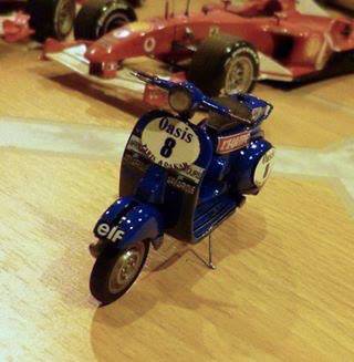
Our project this time is making decals for a 1/24th scale Paris-Dakar Vespa scooter, most of these decals simply are not available to purchase so I had no choice other than to make my own. Rod is also working on a scratch built model of 'Hancock's steam coach' which will again need specialist decals, so both Rod and Ian pooled their knowledge to put together a set of decals to make the most of a decal paper sheet.
Ian chose to start with the hardest decal, the Oasis sponsor logo that goes on the spare fuel tank. It is complex and colourful and OLD! Try as he might he couldn't find a photo’ of this logo, not even a poor one, except for the one on the pictures of the scooter during the event, which were all too small to use. He was going to have to do the whole thing from scratch!
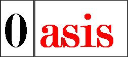
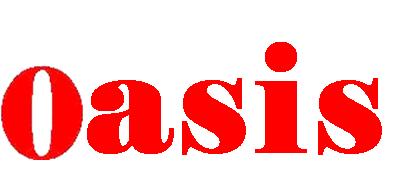
Opening ‘Power point’, and inserting the two new photo’s from my saved files as normal, I positioned the Zero in a nice open space and then clicked on the ‘asis’ photo.
Using the ‘Picture tools - Format’ section and going to the far left of my tool bar where the drop down box is Ian clicked on the word ‘Recolour’. This drops down a new box which contains, at the bottom of the box, the words ‘Set Transparent Colour’ after a scalpel symbol; Ian then clicked on this.
When the cursor is moved back onto the photo it turns into the scalpel symbol again, one click will remove the background colour and allow you to overlap the ‘Zero’ photo to create one word. It may not remove every bit of the background colour, this as because photos save with tiny variations in the colours and the pixels left behind were of a different shade. Don’t worry about this as you will remove them later in the ‘Paint’ stage.
Holding the control button select both items and ‘group’ them. Then draw a select box over them both and right click, save as a photo in the usual way (remember to change settings to 'save as' a PNG file). Now Ian had the first part of the sponsor’s logo.
Going back to publisher Ian could import this new word ‘0asis’. The photo usually up-sizes things automatically but as a photo he could stretch it or reduce it at will. Having got the 0asis photo down to a workable size Ian started to think about the background. Having the word on the page helps to size the background.

At this point it doesn't matter about overall size of the photo, just that you can work easily in that size, so the bigger the better.
The whole finished item will be adjusted to fit the scooter at the end, all that matters now is getting the artwork all in reasonable proportions looking like the original item.
Making a rectangle for the base background Ian used the ‘line’ and ‘fill’ colour tools to set a blue background and turn the outline blue too (black outline on photo).
Then he drew another rectangle filled in white and turned the outline white, for ease of explaining the shapes they outlines have been left in dark colours on a white background.
Ian introduced a rectangle and adjusted the shape to cover the '0asis' word. Then Ian made use of the ‘autoshapes’ section (found in the column of symbols on the left of the screen) and selected the ‘D’ shape from the ‘flowcharts’ shapes. Having adjusted one to the correct size Ian copied it and paste it before flipping the copy to match at the other end of the shape.
Doing it this way means you cut out trying to match the shape individually, which takes time and one seldom manages to match it exactly, and if there is something not right but un-noticed it might well show up when the shape is flipped.
A final ‘D’ from the ‘flowcharts’ symbols was turned through 90 degrees and put it to the bottom. One tip here is for the centring of this shape compared with the rectangle and shapes above. Ian uses the movement circles as markers and while swapping between the two shapes, the rectangle and the ‘D’, adjusted the 'D' until the centre dots stay in the same place when you flip between them. From that point you can pull out to match the Rectangle at each end knowing that each side will remain equally positioned in relation to the other. Obviously Ian only had to pull the bottom centre circle down till he was happy with the final proportions of the shape.
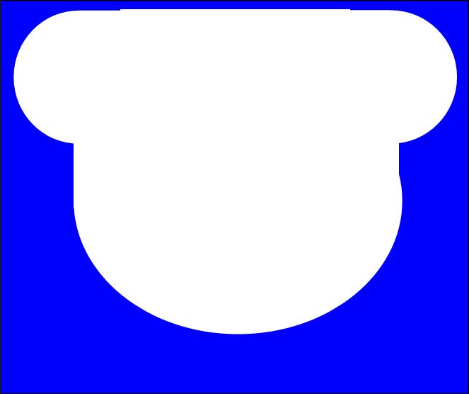

With the hard bit of the background done all that needed to be done was make the background blue and the internal shapes white with white outlines.
This step is the beginning of the picture part of the logo and a way of getting an oval of the right sort of dimensions.
Once you have the right proportions of this oval it can be used to start drawing the picture on.
Ian makes no claims to being a computer artist and only has the ‘Paint’ program on computer to work with, adequate but hardly exciting. He decided it would be wise to use other ovals as a way to make a map of where the colours would go. Once happy with the positions of the oval guides they were grouped and saved them as a PNG file picture in the same way as mentioned above.

This picture was then cropped to get rid of the majority of the unwanted ovals before being opened with 'paint' and the image ‘Zoomed’ up to it’s largest size.
Using paints tools Ian got rid of the lines outside of the main oval and filled in the colour blocks in the different colours; and saved again making sure it was as a PNG
Next step was to repeat the oval shaping process, in publisher, to outline the ‘river’ borders, save it and crop the outside off again just as before. Opening this refined image with paint Ian could once again clean up the outside of the oval and paint in the blue of the river.


Back into publisher and Ian used the ‘call outs’ to find the thinking bubble as it was the nearest shape to the white bubbling spring in the middle of the picture.
Ian had to turn it around a bit and play with the size but once this was done he could ‘fill' it in white and outline in black in the thinnest line available.
With the 0asis and river in position Ian adjusted the horizon lines of the dunes and painted them in more like the original image.
Next comes the most boring bit..... the sky. It’s simple enough just time consuming. selecting a dark blue Ian drew a few lines across the top of the oval, repeating this process using ever lighter shades till he came down into ‘the dunes’.
Now at this point Ian saved the image as a Jpeg photo. In Jpeg his computer feathers the colours a little, great to blur a sky like this but very annoying when you have to go back and clean up letters and borders!

Re-opening in publisher Ian imported some palm tree pictures and positioned them to be as close as possible to the ones in the original logo.
They aren't perfect but once this is all shrunk down they will be more than good enough. Having saved this image Ian took it back into ‘Paint’ and tidied up the colours around the palm trees and the dunes. He also ensured that every pixel in the ‘white background’ was exactly the same colour, another time consuming task but vital when this image goes into 'Power Point' again to have the back ground removed. Finally it was saved as a PNG file picture again.

The next stage means returning to ‘Power Point’ in order to combine the blue and white back ground with the oval picture.
Once again Ian imported the two photo’s and used the re-colour tools to set the background as a transparent around the oval picture.
Once the picture was positioned over the background, within the original oval outline, the images were grouped and the combination 'saved as' a picture (still in PNG).


Now Ian had to take the combination back into ‘Publisher’ to add the Paris-Dakar legend under the oval. This was the toughest part for him.
Unable to find a tool to bend a word in suitable manner he had to write each letter individually, position it and then ‘group’ the word. It took hours and was very frustrating.
Once shrunk down in scale it probably won't be readable anyway. Maybe if we had a high end printer?
Anyway, having grouped and saved it all as a PNG Ian did a few shape adjustments to the whole image before finally adding in the 0asis word picture and saving this image.
After a final clean up in paint the image was saved the image and reduced the image to half it’s size. This is because when you finally reduce the decal to size, in ‘Word’ it can only be reduced a certain percent so if the image is too big 'Word' can’t reduce the image to the required size.
In the end this image would be around 7mm by 4mm in size, grab rule or measure now and check how small that actually is compared to the working image in these photo’s.


Preparing for printing is the hardest bit, Ian measured the spaces on the models and Rod reduced the images to size in ‘Word’.
Rod has more experience in this sizing process having used it for several other unrelated assignments. We were also working together to try and fill a sheet of decal paper with all the ‘Enterprise’ decals and the rest of the Vespa decals.
In order to do this sizing up, the first step is to get the page on your screen to match the size of paper you are using, This may not be 100% of standard A4 as computer screen sizes and shapes vary these images, to be sure you simply have to hold the paper you intend to print on against the screen (as indicated between the two red arrows) and adjust the viewing percentage (located by the white arrow) until the size matches.
You may not get it 100% perfect but get it as close as you can. Now you can measure the spaces in mm or inches as you prefer and match the image size using the normal resizing markers on the picture you have imported.
If you want to check the viewing size against a scale rule it will help reassure you that you are on track. Scale rules sets can be downloaded and printed of for free from “The Hungry Lizard Studios” web site. Or you can purchase scale rules from doll’s house and model making sites as well as from art and architects suppliers.
Once all the images were in place and sized we’re ready for printing. Now don’t rush onto the decal paper, FIRST print on ordinary paper and check the colours and sizes come out as you want them.
We actually cut out the paper dummies and position them on the models to ensure they would fit properly.

Decal paper can be purchased from many places these days. Some craft and hobby stores stock them and there are 'on-line' suppliers in most parts of the world. Our decal paper was purchased from “Crafty Computer Paper” in the UK. They sell everything you need and have pretty good tutorials to help you too.
Once you have printed the images to the decal paper, be sure to handle the page very carefully and allow the ink plenty of time to dry.
Then comes another very important step. Having used an ordinary home inkjet printer the ink won’t resist the water you need to soak the decal paper off the backing paper. It is heartbreaking to watch you hard work washed away right at the point you are trying to put it on the model. The image must be sealed with a clear varnish spray, we used the one recommended by Crafty Computer paper, KEEN acrylic ‘top crystal clear’. It is quite expensive but we know it works! It is also fade and yellowing resistant and easy to use.
All the instructions are on the can but in short a couple of light coats applied from around 30cm away will do the job. Again you want to give this plenty of time to dry.
All that is left is to cut them out and apply them in the usual manner, it’s all considerably easier than we ever thought possible and opens up a whole new set of options for you models.
Does it work?